All the client’s dashboards are saved here.
Example dashboard here, all this information is collated by what you put into Internal:
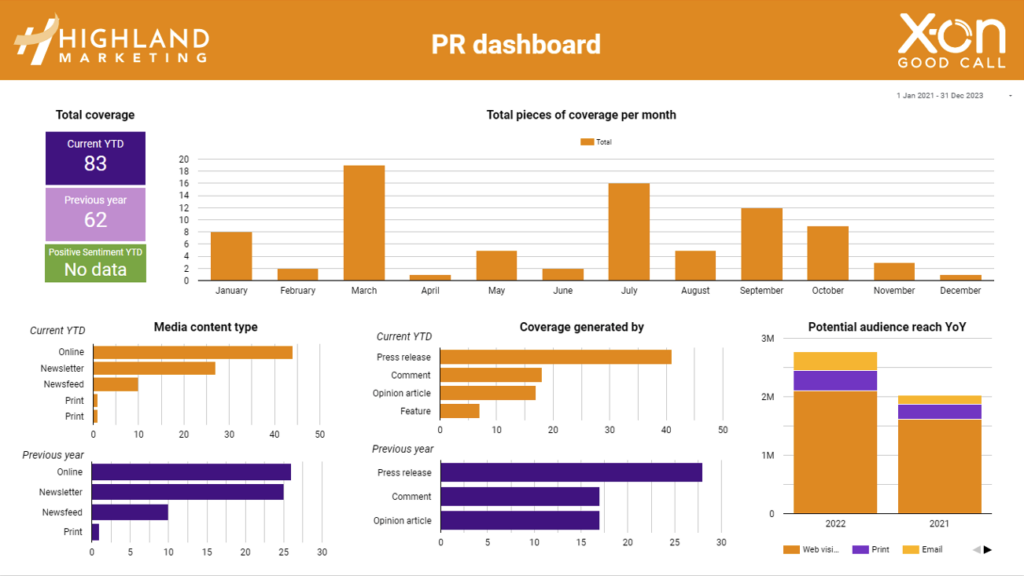
- Total coverage current YTD – this is the number of pieces that have been achieved this year
- Total coverage previous year – this is the number of pieces that were achieved last year
- Positive sentiment YTD – this is how much positive coverage the client had over this year
- Total pieces of coverage per month – the graph shows you the comparison between the client coverage received in every month between this year and the previous year.
- Media content type – these graphs show you how many pieces of coverage were online, in a newsletter, on a newsfeed channel or in print over the 2-year period.
- Coverage generated by – these graphs show you how many pieces of coverage were generated by press releases, opinion articles, comments etc over the 2-year period
- Potential audience reach YoY – these graphs show the client the potential reach of all their coverage
- The all coverage data section below is a spreadsheet of everything that you upload to Internal:
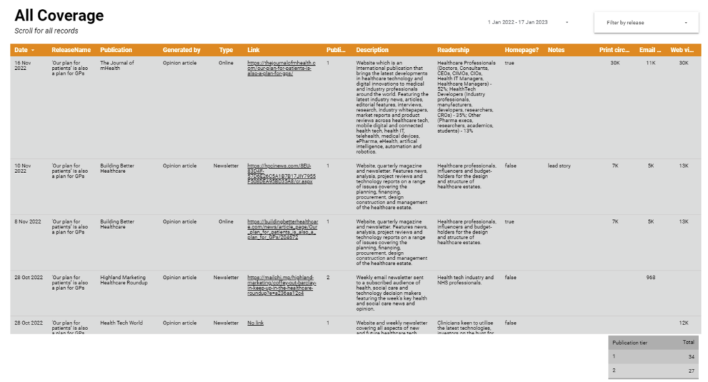
- You can sort this by selecting filter by release
- You can then select the releases you want to display in the spreadsheet